Showing posts with label School magazine. Show all posts

Tuesday, 12 November 2013

Evaluation of Preliminary


What did you find difficult about producing your school magazine? What did you find easy?
I did a lot of planning and research for my school magazine to I was very prepared to take the photos and create the overall look for the magazine. I also already knew the basics of photoshop before so it made the creation process of my school magazine easier as I knew how to retouch people’s faces and create all the shapes I needed for the front cover and contents page. The one thing I did struggle with was trying not to make the magazine look to much like a fashion or music magazine as that is the style I prefer; however, I feel I have adhered to the school magazine theme well.
How would your task have been easier if you had researched into school magazines?
I did research into the school magazine genre (evidence of which can be found earlier on my blog.) I search existing school magazine front covers and did some analysis of some front covers as well as search the codes and conventions of school magazines.
What tactics did you use to attract your audience?
I used bright colours to attract my readers to the magazine then I also included an interesting splash and secondary leads that stood out on the background they were on. This meant that the readers could easily read the text and could see the interesting articles featured in the magazine.
What have you learnt about photoshop/other software used in the production of your preliminary task?
I already knew the basics of photoshop before I started creating the school magazine, but I have discovered new buttons on photoshop for different shapes and effects to change the images I have taken.
What lessons have you learnt here that will enable you to excel in the production of your main task-the music magazine?
I have learnt to always ask for feedback off my friends and teachers about my magazine as there might be some things that I miss when I look at it- like the fact it needed more colour to highlight some of the shapes and text.
Monday, 11 November 2013

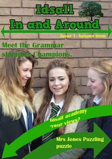
My school magazine after feedback.

I got some feedback off my friends for my school magazine and Erin (http://www.erinsmediastudiesblog.blogspot.co.uk/) told me I should maybe include some more colour, so I did.

I changed the black text on the arrows to yellow as it fits in with the yellow on the girls ties and it also looks good with green. I also changes the 'issue' text to yellow to provide a bit more colour difference on the page.
On the cover page I also changed the 'issue' text so it matched in with the cover. I also put borders to the images to make them pop and look more interesting for the reader. I changed the spacing between some of the items so it was layout out a little better and the arrow  and the picture of the two girls didn't look so clustered. I also put a black border around the arrows that point to the pictures as they didn't stand out much once I put the border on the images.

Creating my school magazine


 This is how I created my magazine.
First of all after photoshopping both images of the girls I decided to use this image on the cover as they are smiling more on this one. I picked this background as it was easy to photoshop. When I put the photo on the right szed page it was too small so I added more bricks onto the top of the image, from the orignal unphotoshopped image.


 I then added the title I had created earlier and made it the right size to fit on the page. I thought that the green looked good against the brick background and that it was clear to read.

I then added the tree logo and the arrow motifs. I added in the arrow under the title to cover up the slight line that the two different backgrounds made instead of lower down as I had previously thought. I created the two curved arrows by using the tick shape as well as the arrow head shape. I chose to have the arrows different shades so they didn't look two similar, and the different shades of green make it look more interesting and eye catching.  The tree logo was added at the top instead of the bottom as I had originally planned as I decided I wanted just the 'idsall' at the top of the page, so there was room at the top of the page for the logo.

I then added some text in as the splash and secondary leads. I used green on the background as it stood out and black on the arrows as again it stood out the most whilst keeping in with my colour scheme. I chose a font that was interesting unlike boring times new Roman, but still legible, so nothing like comic sans. I chose to have the size of the text at 25 pt as I thought it wasn’t too big yet you could still read it with ease.


That was then my front cover done so I moved on to making the contents page.


After making the page the correct size I added the titles I had created earlier and made them the right size to fit the page. They are the same style as the title on the front page, but slightly different sizes and have different border thicknesses. I also added in the arrow from the front page but spun it 180% so it faced the other way. This was so I had more room above the arrow and less room beneath it.


Next I added in the logo of the tree and adjusted the size to fit under the arrow and I added the 'issue' text from the front page. I kept these the same as on the front page so the front page and content linked in well.


I added in the text for the stories on the contents page. I created some of these from things I have seen around school, for example the language focus, I got some ideas from similar sections of the Idsall voice (the actual school magazine,) and things I would imagine a school magazine to include. I chose a different font to the text on the front page (the splash and secondary leads,) as this is more for reading so I picked a slightly thinner font so it was more easy to read. I also picked a font that was more like paragraph text then a heading font.

I then finished off by adding in the images after I had photoshopped then. I added in another picture of the girls- the 'Grammar slammer winners!' but with different expressions and different angles to make the magazine more interesting and add a bit of variety. I also added in a picture of two girls on a white background to vary the background types and again make the contents page more interesting.


Thursday, 7 November 2013

Creation process of my magazine

I started by drawing out what sort of thing I wanted to do for my final draft of my school magazine from what I didn't like or what didn't work well in my practise magazine.


 Next I went out and took some images to use on my magazine. These are some photos from the shoot.


I used most of these images in my magazine, I did edit them though.


Wednesday, 6 November 2013

My School magazine practice

I have mocked up what I may like my school magazine to look like.
 I have used copyright free photos to mock this up.
I feel that I need to:
-Use a logo for the school on the cover.
-Make the image fill more of the page.
-Make the text easier to read.
-Use better ideas for the secondary leads.

What I feel I have done well:
-The text looks good.
-The title is interesting.
- The white space is filled.
-The images are edited well.


This what the old image of the headteacher looked like before I edited it. I took off the background, cropped the image and generally cleared up some imperfections on the image.


This is what the old image of the students looked like. I took off the background and cleared up any little imperfections on the image.

Friday, 20 September 2013

What I will and won't do for my school magazine layout.


This is the current Idsall Voice layout. It doesn’t really have a front page, it just launches into the text. I will not do this as I feel that a magazine, even if it is a school magazine, needs a front cover. For me it seems more professional and complete. Also, just launching into information may intimidate some people into not reading the magazine.


This is a better example of a school magazine layout. It has a front page telling you what is inside the magazine. It appears to use the school colours and logo. However, as some of the text goes over the image a small amount of the text is harder to read. I prefer this layout to the Idsall voice layout; however I would still do some things different.

Although this magazine looks professional with the logo, school colours and general layout, I feel that it looks too busy.  I won’t just launch into an article on the front page like this magazine does. I feel it intimidates the reader, into not reading the magazine.


I would use something like this for my front cover. I would have large image from the main article, or of some students in the middle of the page. For this example I couldn’t find a suitable image. In the boxes around the page I will have headlines of articles inside the magazine to attract attention and convince the reader the magazine is worth reading.


Thursday, 19 September 2013

What I will and won’t do for my school magazine text.

For my school magazine I will use a simple text that people can read and understand. It is important that this part of the magazine is right; as this is the bit that conveys the information to the audience.

I could use a simple font like Times New Roman:  ABCDEFGHIJKLMNOPQRSTUVWXYZ

Or even Verdana: ABCDEFGHIJKLMNOPQRSTUVWXYZ.

Verdana is more interesting than Time New Roman which has now got the reputation for being boring, and typical of a monotonous piece of work. However, both of these text fonts are suitable, but I will probably use Verdana because I like the look of it better and I feel it is easier to read than Time New Roman.
I will not use a text font like Brush Script MT: ABCDEFGHIJKLMNOPQRSTUVWXYZ.
It is very hard to read especially for lower school children.
Also I will not use a text font like Curlz MT : ABCDEFGHIJKLMNOPQRSTUVWXYZ.
This is because it looks childish and unprofessional, and is also hard to read.

Wednesday, 18 September 2013

What I will and won't use for my school magazine title.

To start with, I won't use a boring plain Times new Roman title. It is boring and doesn't capture the reader’s attention and imagination at all.  The text font has to be simple so people can read and understand it, so the title needs to be more interesting to involve the reader.This is the real Idsall voice title.


If I took the Idsall voice (my school magazine) title for example I would change the title to look something like the following:

But again this title simple.You could make it more elaborate and interesting. This title is more interesting, unique and recognisable then the original though.


I could go further and add the school logo into the title as well, to link the school colours, logo and name of the magazine together and make the magazine look neat and more together as a whole, and linking it strongly to the school. This is more like something I would use for my school magazine title.


I defiantly won’t be using a title like this. It doesn't fit in with the Idsall school colour scheme at all, and could be harder to read and understand. It looks childish and unprofessional. 


I would not use something like this either as it is even more difficult to read, and doesn't fit in with the school colours. Also it doesn't match the connotations of a school magazine.

School magazine codes and conventions.

What are codes?
Codes are systems of signs, which create meaning. They can be divided into two categories – technical and symbolic.
Technical codes: These are all the ways in which equipment is used to tell the story in a media text, an example of this is the camera work in a film.
Symbolic codes: Thses show what is beneath the surface of what we see. An example of this is a character's actions show you how the character is feeling.
Some codes fit both categories. For example music is both technical and symbolic.
What are conventions?
Conventions are the generally accepted ways of doing something. There are general conventions in any medium. An example would be the use of interviewee quotes in a print article. Conventions are also genre specific.
How do codes and conventions apply in media studies?
Codes and conventions are used together in any study of genre; it is not enough to discuss a technical code used such as camera work, without saying how it is conventionally used in a genre.
For example, the technical code of lighting is used in some way in all film genres. It is a convention of the horror genre that side and back lighting is used to create mystery and suspense – an important part of any horror movie.
Evolve
The Evolve magazine has a clear heading at the top, with a green background, and an image taking up the lower two-thirds of the page. There is no definitive colour scheme or style, although the front cover is well defined and clear.

Top Terrace
The Top Terrace magazine does not have a defined ‘front page’ – it launches straight into the information. However, images and layout are used effectively, with two large pictures.


Bishopbriggs
The Bishopbriggs newsletter is very simple. It has a white background, with a header, logo on the right and two photos relating to activities within the school. The date is at the bottom of the magazine. There is no real colour scheme although there is a blue graphic of circles used throughout the newsletter.


Some codes and conventions I have seen.
  • The magazine title is always at the top, at the left or centre of the magazine.
  • Images are typically to the right of the text, or in the centre of the page below the title.
  • Choosing a colour schemes is good as too many colours are distracting - (make sure to leave plenty of white space so that the eye is not too confused.)
  • Maintaining a graphic element makes the magazine look a little more professional. For example: bars for the page headings and along the side of the article, or circles on the header.
  • Most have a very colourful collage of pictures, probably of events that happened at the school. This is visually attractive and already gives the reader an idea of the school.
  • The logo of the school is often included and displayed next to the school's name. The logo is the same colour as the school's title text, which clearly links the two.
  • I have found the main image of a school magazine is relevant to the content that will be inside it.