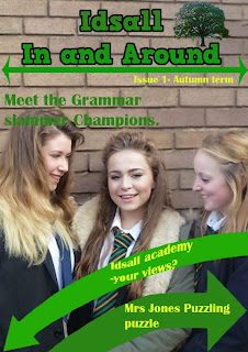
I got some feedback off my friends for my school magazine and Erin (http://www.erinsmediastudiesblog.blogspot.co.uk/) told me I should maybe include some more colour, so I did.
I changed the black text on the arrows to yellow as it fits in with the yellow on the girls ties and it also looks good with green. I also changes the 'issue' text to yellow to provide a bit more colour difference on the page.
On the cover page I also changed the 'issue' text so it matched in with the cover. I also put borders to the images to make them pop and look more interesting for the reader. I changed the spacing between some of the items so it was layout out a little better and the arrow and the picture of the two girls didn't look so clustered. I also put a black border around the arrows that point to the pictures as they didn't stand out much once I put the border on the images.


No comments:
Post a Comment