Showing posts with label construction. Show all posts
Showing posts with label construction. Show all posts
Wednesday, 12 March 2014

Tuesday, 11 March 2014
Monday, 11 November 2013
My school magazine after feedback.
I got some feedback off my friends for my school magazine and Erin (http://www.erinsmediastudiesblog.blogspot.co.uk/) told me I should maybe include some more colour, so I did.
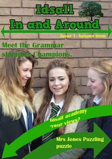

I changed the black text on the arrows to yellow as it fits in with the yellow on the girls ties and it also looks good with green. I also changes the 'issue' text to yellow to provide a bit more colour difference on the page.
On the cover page I also changed the 'issue' text so it matched in with the cover. I also put borders to the images to make them pop and look more interesting for the reader. I changed the spacing between some of the items so it was layout out a little better and the arrow and the picture of the two girls didn't look so clustered. I also put a black border around the arrows that point to the pictures as they didn't stand out much once I put the border on the images.


I changed the black text on the arrows to yellow as it fits in with the yellow on the girls ties and it also looks good with green. I also changes the 'issue' text to yellow to provide a bit more colour difference on the page.
On the cover page I also changed the 'issue' text so it matched in with the cover. I also put borders to the images to make them pop and look more interesting for the reader. I changed the spacing between some of the items so it was layout out a little better and the arrow and the picture of the two girls didn't look so clustered. I also put a black border around the arrows that point to the pictures as they didn't stand out much once I put the border on the images.
Creating my school magazine


I then added the title I had created earlier and made it the right size to fit on the page. I thought that the green looked good against the brick background and that it was clear to read.

 I then added some text in as the splash and secondary leads. I used green on the background as it stood out and black on the arrows as again it stood out the most whilst keeping in with my colour scheme. I chose a font that was interesting unlike boring times new Roman, but still legible, so nothing like comic sans. I chose to have the size of the text at 25 pt as I thought it wasn’t too big yet you could still read it with ease.
That was then my front cover done so I moved on to making the contents page.


Next I added in the logo of the tree and adjusted the size to fit under the arrow and I added the 'issue' text from the front page. I kept these the same as on the front page so the front page and content linked in well.

I added in the text for the stories on the contents page. I created some of these from things I have seen around school, for example the language focus, I got some ideas from similar sections of the Idsall voice (the actual school magazine,) and things I would imagine a school magazine to include. I chose a different font to the text on the front page (the splash and secondary leads,) as this is more for reading so I picked a slightly thinner font so it was more easy to read. I also picked a font that was more like paragraph text then a heading font.


Thursday, 7 November 2013
Creation process of my magazine
I started by drawing out what sort of thing I wanted to do for my final draft of my school magazine from what I didn't like or what didn't work well in my practise magazine.


Next I went out and took some images to use on my magazine. These are some photos from the shoot.


I used most of these images in my magazine, I did edit them though.


Next I went out and took some images to use on my magazine. These are some photos from the shoot.


I used most of these images in my magazine, I did edit them though.
Wednesday, 6 November 2013
My School magazine practice
I have mocked up what I may like my school magazine to look like.
 I have used copyright free photos to mock this up.
I feel that I need to:
-Use a logo for the school on the cover.
-Make the image fill more of the page.
-Make the text easier to read.
-Use better ideas for the secondary leads.
What I feel I have done well:
-The text looks good.
-The title is interesting.
- The white space is filled.
-The images are edited well.

This what the old image of the headteacher looked like before I edited it. I took off the background, cropped the image and generally cleared up some imperfections on the image.
This is what the old image of the students looked like. I took off the background and cleared up any little imperfections on the image.


I feel that I need to:
-Use a logo for the school on the cover.
-Make the image fill more of the page.
-Make the text easier to read.
-Use better ideas for the secondary leads.
What I feel I have done well:
-The text looks good.
-The title is interesting.
- The white space is filled.
-The images are edited well.

This what the old image of the headteacher looked like before I edited it. I took off the background, cropped the image and generally cleared up some imperfections on the image.
This is what the old image of the students looked like. I took off the background and cleared up any little imperfections on the image.

Subscribe to:
Posts (Atom)